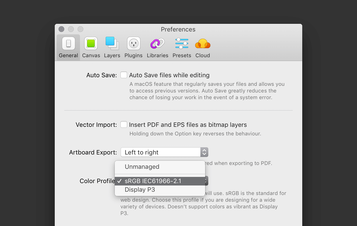
I believe colour management is an essential feature for professional design tools — being able to rely on what you’re seeing when choosing colours, deciding on contrast, and assessing legibility is critical. The last two articles (part 1 and part 2), covered the basics of colour management. This article details the settings required for screen design in many popular design tools.
The assets you require and the platforms you’re designing for will likely dictate the best colour management approach, and the colour space you should be using.

If you’re designing a website, CSS and SVG are specified in sRGB, so your documents should be set up as sRGB. CSS level 4 will likely support more colour spaces. SVG is also likely to gain support at some point in the future. If you’re building an app that uses web tech, stick with sRGB for now as well.
If you’re designing an iOS, Android, or Mac app, you should probably also work in sRGB. There are situations where you may choose to, or be required to use a wider gamut profile like Display P3, but those are still fairly uncommon. If you do choose to work in Display P3, you’ll still need a full set of sRGB assets, making your app binary far larger (yes, Xcode can generate them for you for iOS and macOS, and yes, App Thinning helps). If you’re using code drawn elements, Android, iOS, and macOS support wide gamut profiles (support varies based on the OS version you require though).


